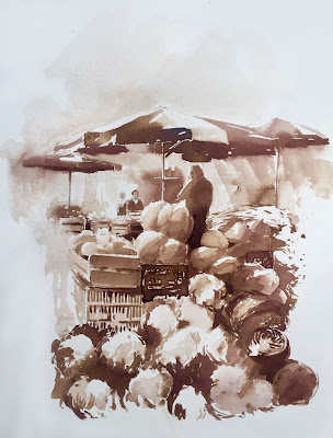
Monochrome ink paintings...
Hello, new painting technics here with my students again.
Monochrome ink (Sennelier) studies of market views. I found it fast to paint with, easy to get darks with the colors I used here (Sepia and Bistre). I mean it's faster to build up values with these than with watercolors which tend to fade when dry.
I try to transmit the notion of less details, or to chose what captures them most. So squint your eyes for seeing masses, shapes only. Put in the main ones on the paper with graphite, or felt pen if you like in the same color as the ink. Then start painting the bigger shapes or those that will lead you to a start result the quickest, dont begin with details like every fruit or vegetable, you will have to simplify them all. I paint directly, like if I'm drawing. I try to get the value of each wash right, or as close as possible overlaying is fine but not everywhere, clean and spontaneous washes look nice, just as shapes done with confidence.
Don't worry about the result, it will come with more practice. If your result looks clumsy it could be because of your worn out brush, or maybe it's size, shape or quality of fibers. Points and edges should be sharp in that case. You can use the worn out ones for rougher effects. If you feel lost with what you see it's because you might not draw regularly enough. Drawing sharpens comprehension of our vision.


Comments
Post a Comment